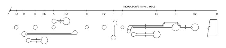
Interpreting Hole Distribution ChartsHole-what charts?On some of the pages on this web site, you'll find charts that illustrate how the holes on a particular flute or flutes are set out. This is a new type of chart not used as far as I know by other analysts. This page gives you a little background on these charts and how to make sense of them. Why do we need them?Many of the intonation problems of early flutes can be traced to the irregular way in which holes have been laid out on the instrument. Even after this fact was realised and talked about freely, it was a long time before practice caught up with theory. We can learn a lot about the maker's understandings by examining their instruments with this tool. A schematic/distribution chartHere's one example of a hole distribution chart. It shows a small hole Nicholson's Improved flute with a schematic representation of the keywork and a scale showing the actual location of the holes. When we look at the flute or a representation of its keywork, we tend to be distracted from the issue of how well the holes are distributed. Look at the keywork below. Looks good enough. Now look at the scale at the top of the image to see how bizarre is the separation of the holes. Each note is a semitone apart. Does that spacing look at all uniform?
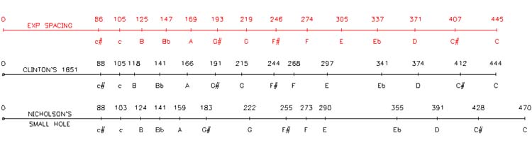
Lose the headFirstly, we need to understand that in these charts only the body and foot section are illustrated. The head and barrel section of a flute varies in length depending on the position of the slide and is therefore not of much practical interest to us. The left of the drawing is the start of the conical section (top of the body). The extreme right hand end is the end of the foot. A question of rotationHoles on a real flute are distributed around the tube - some on top, some on the sides and in varying degrees. The hole distribution chart doesn't attempt to illustrate this; indeed for acoustic considerations, rotation is irrelevant. The waves run up and down the flute, not round and round. A comparative distribution chartThis chart compares hole distribution on two flutes - a Clementi & Co Nicholson's Improved and Clinton's 1851 instrument made by Potter.
In addition, an "exponential spacing" scale provides a reminder of the kind of spacing we might have expected. Is Red Right?It's important to recognise that the red "exponential spacing" trace is not an ideal to which the maker should have aimed, but just an example of what theoretically uniform spacing might look like. The "uniform spacing" ideal is a little false. For example the relatively perfect truncation at the far end of the tube is dramatically different to the far-less-perfect truncations represented by finite sized tone-holes along the tube. So you might reasonably expect the C to C# interval to not exactly follow the rules observed elsewhere. It's also perfectly valid and normal to grade the size of holes to make up for minor irregularities in spacing. But limits and penalties apply, and our idealised trace does help alert us to possible infringements. "Frets" call you these?Indeed, the Shrew's immortal words are well placed. Look again at the tick marks on the red "exponential spacing" trace - the similarity with frets is undeniable. The lower we go in pitch (i.e. down the flute or along the neck of the guitar) the further apart the frets or holes should get. It's an exponential series with each interval about 6% (actually the 12th root of 2) longer than the one preceding it. And now look at the charts illustrating the real flutes. Would you buy a guitar whose frets were spaced like that? Would you accept an argument that it's OK because some of the frets were thicker? The length of a piece of stringYou will notice our two real flutes (or at least their conical sections) have differing lengths. In this case, that's because they represent flutes of different eras and definitely differing pitches. But even at the same time and pitch, flutes could vary in length if tapers of differing slope are used. While the indication of length is interesting, it's mostly the evenness of spacing (in an exponential sort of way) that we are trying to assess. So what might we learn?Heaps, but let's take it step by step. That picture again:
Looking to the Nicholson, we see:
Well, let's face it, sorry Mr. Nicholson, it's a mess. Every one of those intervals should be a semitone, yet some of them (e.g. E to Eb) are more than three times as big as others (e.g. E to F). Sure you can play with the size of the holes, but you can't hide irregularities like that! Playing the flute confirms the picture. The intonation of this flute is absolutely laughable. Excuses, excuses!Now to some extent some unevenness in spacing is inevitable. We have a few fingers on only two hands. The fingers only stretch so far. We have to cover a distance longer than our hands are wide. We are forced to cluster. We can see the signs of clustering in this trace:
Further, the G# hole and the G hole are separated by the tenon and socket joint that holds the two body sections together. So we expect a bigger gap here. None-the-less, the overall outcome is unacceptable. And the Clinton?Far better in general, and somewhat higher in pitch. But not entirely logical either, despite Clinton's stated intentions. Then again, this is his first practical model (as far as we know at the moment), and perhaps we can't expect perfection straight up. Certainly the foot notes (Eb to C) seem well spaced, but the body notes (E and above) are still a little scrunched. We note also that some holes (particularly B, F and E) are unusually high on the tube. This might be erroneous, or done deliberately to solve problems in the third octave. The chart cannot explain these things, but can alert us to their existence. We'll be looking at these issues in the relevant areas of the web page. ConclusionThis new technique permits us to illustrate hole distribution in a useful and understandable way. This achieves a lot:
AcknowledgementThe drawing of hole distribution charts on this web page have been carried out by Seattle draughtsman and flute player Tim Gallagher. Use your browser's Back button to return |